Henrietta Logo

A general explanation of the logo:
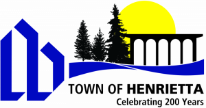
A simple configuration of a home was used to develop a letter form that represented the letter "h". (For assistance in seeing the "h", please see the video at the bottom of this page.) It was felt by integrating the letter and symbol representing the home, and keeping the design clean and graphic, and giving the illusion of an upward thrust, all three of the major criteria could be met. Another element was added by introducing town colors. The colors chosen were black and green, always to be used as stripes on a white field. Green to represent the ground; black, the strength of a town united; and the white field for the simplicity of a good life. The stripes represent the openness, the large amount of area incorporated in Henrietta, allowing people to live together without the chaos or the intimidation of the industrialized city.
A history of the logo:
A long expressed need for a cohesive public image for the Town of Henrietta, "The Town of Friendship," culminated in a complete visual identity program produced by the students of the National Technical Institute for the Deaf's In-House Co-op Program, NTID Art Department. The bulk of the work was done by Joseph Viscardi, Jr., a senior majoring in Communication Design in the College of Fine and Applied Arts at RIT.
The project was suggested after many town officials, townspeople, and business people began to express their concern about the bad press, the lack of an image, and the difficulty in finding any consistency in discussing Henrietta, in visual or any other terms. Jack Slutzky, coordinator of the NTID Art Department's In-House Co-op Program was contacted by a town official to discuss the feasibility of art students making recommendations to the town in combating the aforementioned problems.
Based on the objectives of the In-House Co-op Program, specifically to give students an opportunity of working with real clients, real needs, and giving students an opportunity of practicing and implementing theories learned in the formal classroom setting, Mr. Slutzky accepted the project. The first stage in setting up an identity program was research. The results of the research turned up the following:
- There was no prescribed way of using the town name, no specific type style, no format, no colors, no consistency whatsoever. There was a town seal (which people were not aware of), a town flag, which hardly anyone could identify, various forms, stationery, pamphlets, brochures, which had no relationship to one another.
- The second part of the research consisted of identifying those criteria which the townspeople thought of when trying to identify the Town of Henrietta. Many people were interviewed. There were three basic recurring themes that came out of the research:
- Henrietta is a town of homes, a good place to live, with great emphasis on a person's dwelling.
- Henrietta was a growing community, progressively trying to meet the needs of its constituency.
- People were proud of the community, but could not understand why it continuously received bad press.
At this point, with the criteria identified, the visual part of the assignment was begun. The student assigned the responsibility of developing the visual program was Joseph Viscardi, Jr. The project was begun during the summer quarter of 1977. By the middle of fall quarter, the initial creative work was ready to be shown. A presentation was made to Town Supervisor Jack Kelly, who was pleased with the program. He stated that he could not make a commitment for the town, but stated he would be happy to have Mr. Viscardi present the information to the Town Board. Mr. Viscardi requested that he continue working on the project as part of his official course of study, by using this as part of his senior thesis.
Under the guidance of Joe Watson (faculty member of the Communication Design Department) and Jack Slutzky of the NTID Department of Art, Joe Viscardi completed the first stage of the identity program by refinement of his basic concept and setting forth the initial applications. On April 18, 1978, Mr. Viscardi and Mr. Slutzky made a presentation to the Henrietta Town Board. The work was overwhelmingly approved and formally adopted by the Town Board on May 17, 1978 via Resolution #11-130/1978.
Bicentennial Logo
 As part of the Town's Bicentennial celebration, Betsy Martin designed a logo meant to depict the important aspects of the Town of Henrietta. The building is representative of the highly recognizable Town Hall. The sun represents a new day and the future. The canal, which helped to aide in the farming prosperity experienced in Henrietta during the early development of the area, as well as the Genesee River, are depicted by the two waterways. The numerous green areas, parks, and the ever popular Tinker Homestead are represented by the trio of trees.
Official Town Seal
 In 2018 the Town considered revising the Town seal, which featured only the word "SEAL". Two options were proposed: 1) the Henrietta logo; or 2) a cropped version of the Town's Bicentennial logo. A public vote was held on the Town's website. Once the ballots were tallied, 60% of the votes were for the Bicentennial logo. As a result, the Town Board adopted Local Law No. 9 of 2018 on November 14, 2018 to adopt the new Official Town Seal featuring Betsy Martin's Bicentennial logo.
Sesquicentennial Logo
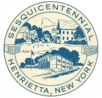
 In 1968 the Town celebrated its Sesquicentennial and the program booklet created for the week long celebration featured the logo pictured here. The logo itself is signed by Erickson, but unfortunately more information pertaining to the logo is unknown.


